TEAMSENSE
Brand Illustrations
Direction and execution of replacing SVG illustrations with a customized library better suited to brand goals and company values.
1. Original Illustrations
The original illustrations were done completely from scratch by a prior designer. The characters were affectionately called “doozers”. While cute, the illustrations were difficult to generate more of, were overly simplistic, and couldn’t display the company’s values as vividly without distinctions and expressions.


2. Choosing a Style
The primary audience to appeal to were hourly workers and specifically workers in a manufacturing, warehouse, construction, or similar type industry. I chose a primary color palette that was desaturated and rustic while still being modern. The color palette’s core colors are just a few shade, but a full set of tints was used to create vibrant illustrations still on brand. All character skin tones that look natural, are still within the brand palette. Some concept art includes people in work hats, boots, and sturdy clothes. It was also critical to company values that we displayed a diverse array of people.
Stubborn.fun
Stubborn Generator
I decided to use an excellent, free library called Stubborn Fun as a base for the new illustrations. Since the illustrations were for a start-up, being budget conscious was essential.
3. Final Illustration Set
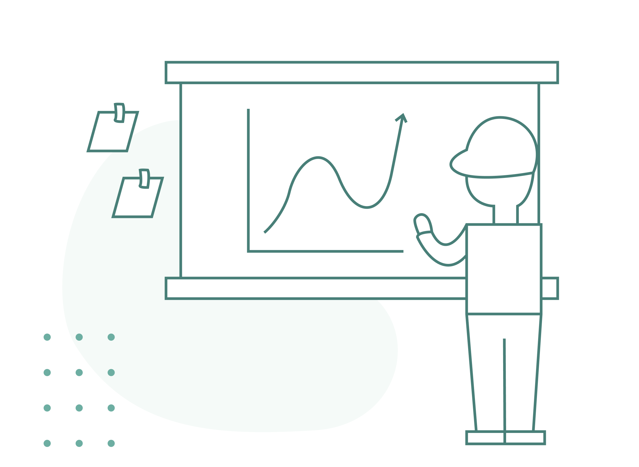
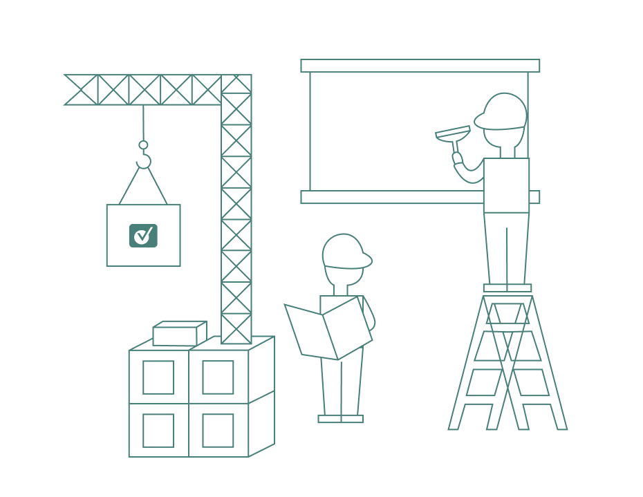
After initial changes and gathering ideas from the internal team, I created and posed over a dozen high quality svg illustrations with custom characters and scenes.
Adding new clothing items, characters that may resonate with a LGBTQ+ audience, and characters with different body types and of different ages.
Creating custom furniture and background items specific to manufacturing and warehouses, along with reposing characters to high five or be facing away from the viewer.


